Because the beaver isn't just an animal; it's an ecosystem!

Tag: Kiriko Moth


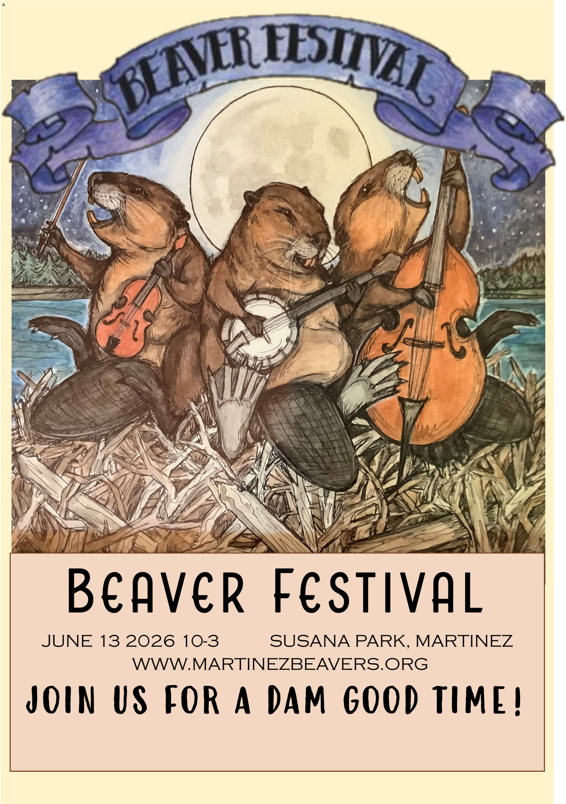
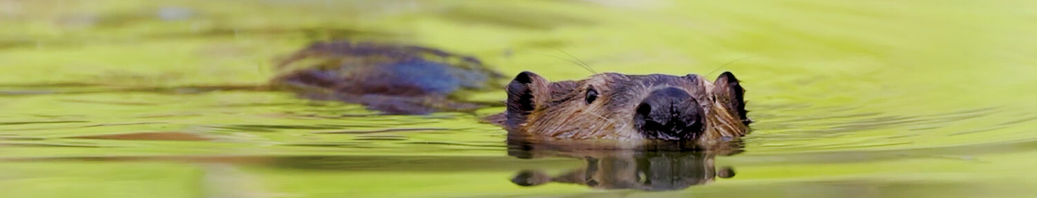
This weekend someone commented on our logo with the perfect sentence “Oh because beavers are the KEY to the creek, right?” And it got me remembering how it all came together.

Once upon a time, many years ago, Worth A Dam needed a logo. I fiddled with logo picsome primitive images and asked around the best I could and got the suggestion to look for a volunteer on Craig’s list. I was told to advertise for a “Free gig” and say what we needed.

The truly amazing thing is that I immediately received more than a dozen offers. I actually had to review applications for an unpaid job drawing a beaver logo. It was 2009 and the time the Martinez Beavers were bigger news than they are now. I reviewed cute graphics, manly graphics and gothum graphics. I got offers from the Southbay, the Northbay and San Francisco.

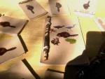
The woman that finally intrigued me was Kiriko Moth, a graphic artist in the city. She’s has gotten bigger and her website is amazing if you want to catch a peek. She had just finished some lovely illustrations for a book on bees that compelled me. We had a conversation about my ideas and she sketched a host of designs which I liked – including one with children’s faces. I wish I had the sample sheet she sent just to remember. But at the time I asked her to think about incorporating the key idea, and maybe a stream.

She came back with a stream dividing the beaver (in blue and reversed with the wide part at the top). I suggested we do uncolored and offered the idea of flipping it so it looks like you’re looking into the distance. Then we chose fonts to go around it. And Voila the logo was born. When mom died she was kind enough to notch the tail.

legacy_logo2lgOne thing she said as we were discussing fonts was to avoid papyrus. She said TOO many non profits used it already. I thought at the time that was an odd thing to say, because I happened to love papyrus. Maybe you do too. But now years later I have seen over and over that she was right. Here’s a little sample, but keep your eye out and you’ll find millions.

papyrusI have to ask myself what quality we all possess that draws us to this font? Even many of the logos that were professionally designed and avoided the danger of using the font actually chose fonts that look LIKE papyrus.

Apparently the advice NOT to use papyrus has to be sternly administered from lots of sources. It is all over google.

There’s a psychological paper there just waiting to be written.


Let’s review. Nearly three months ago our mother beaver died. There were outpourings of support for her and the three kits she left behind. Worth A Dam wanted some kind of memorial to her remarkable life and approached local artist and UCD professor Paul Craig. Paul is an old friend of the beavers and was thinking of them when he designed the metal beavers for the library sculpture. Paul said he would happily make a mother and some kits if we could get him some silhouettes to work from.

Chapter two. I contacted the recently graduated but-as-yet-unemployed graphic artist (Libby Corliss) who designed our brochure and map and asked her for help. She said she could easily turn photos into silhouettes if we could find the right photos. Three of cheryl’s pictures did the trick, and for the fourth we filled in the drawing of our logo beaver generously donated by another graphic artist, Kiriko Moth. Paul quicky produced the metal pieces and we marched down to the city council meeting to ask permission to hang them.

Chapter three. In a down-the-rabbit-hole twist of fate we were given full approval and gratitude, told to go ahead and display them on the sheetpile wall, and to work with city staff who would help us get it done. I later met with Bob Cellini and gave him the beavers and talked about where they might work. I was surprised to learn that Bob does similar metal cuttings and has been meaning to get around to making one for his wife to display in the garden.  I first met Bob in 2007 after the subcommittee had been formed but before Skip had installed  the flow device. Staff had made the decision to take down the dam by a foot during the interim month  before he could get here. I was standing at the bridge when he was reviewing the job and introduced himself mournfully as the man who was going to do the ‘dastardly deed’. I immediately liked him for that. I liked him even more when he said that the binder of articles I had distributed at the first subcommittee meeting was in the staff room and had become the ‘beaver bible’.

Chapter four. So tuesday I got an email from Bob that the beavers were ready to be installed and he had invited the Contra Costa Times photographer for the ‘unveiling’. When Lory got there thursday morning this is what she saw,

With the drop cloth removed, this was the display. Bob made the frame and arranged the beavers in it. Don’t they look happy together?

I was worried that they’d be spread apart or scattered, but I love this family grouping which clearly shows mom taking care of them. Obsessed beaver fans like myself will no-doubt note that the notch in mom’s tail is on the wrong side, because the metal has been reversed. Never mind. I like her approaching the bridge, almost as if she’s coming to ask us for something. I am incapable of avoiding the thought that she’s bringing the kits to meet us and asking us to take care of them when she goes.

I am so grateful for everyone’s help in pulling this together. I love the idea that somewhere on a sheetpile wall, mom beaver and her last three kits will be together forever.


Yesterday I was so thrilled with the new logo I dangled it appealingly in front of Jean Matuska who helps with the web design and said, wow wouldn’t this look great on the header, gosh too bad no one knows how to put it there. Mean while I was dangling the logo appealingly in front of the designer Kiriko Moth and saying, gosh wouldn’t this look great on a hunter green table cloth, too bad its the wrong color.

Joyfully, Kiriko offered to print the opposite of the design, and send that to our tablecloth order. And Jean figured out how to tuck the logo into the photo strip. Once we saw how easy it was to change the header I asked very politely, maybe someday, when she was burdened with free time, we could choose the photos together? Because our original web designer, Michael Cronnin, just picked those photos without our input. And Jean, who was inspired to great heights by the lovely logo and a charming owl protest on sunday, said, pick the photos and I’ll do it for you.

Give a hoot!

It was her 10th anniversary, so when they got back from a celebratory dinner, she made the switch! I wished her a very happy anniversary and assured her it was excellent luck to fix a beaver website on such an occasion. (Since beavers mate for life.)

I love the new photo strip, all originals from Cheryl Reynolds, more than I can say. But I thought it would be good to pause and remember the old one fondly. It saw the beavers from a time of great danger to a time of civic protection. From a time when we the site had 80 readers a day, to a time when it had 800 readers a day. It was a gift from a friend who donated generously with his time and made the painstaking transition from martinezbeavers.com to martinezbeavers.org/wordpress. It featured the dam and the flow device because that is what everyone needed to focus on. Now it features our heroes. The strip is dead. Long live the strip.


Yesterday was several days of wonder layered into one. Our artist, Kiriko Moth, released the final edits to the Worth A Dam Logo, and we couldn’t be more happy with it. Now its off to the printers to have it placed on a banner and display tablecloth, and maybe some teeshirts! Hopefully I can figure out how to switch it for that alarming orange rodent in the address bar that Michael installed years ago. In the mean time, I offer you a closeup for your viewing pleasure.

One thing I love about it is that even if you are ignorant of the concept of a “Keystone species” it is clear that the beaver is the key to the river, and the key itself is a kind of dam, which couldn’t be better. Any local henna artists might think about adding this to your stencils and joining us for the beaver festival this year!

The second grand layer of news was that when I came home from work there was a DVD from Don Bernier of the trailer for the Concrete Jungle. 12 minutes of introduction to the series and three of them about the Martinez Beavers. Mayor Schroder was there, sounding deceptively reasonable, Al Turnbaugh was there to be the villian of the piece, and Skip Lisle was clearly the hero. At one point there was a very intelligent female voice describing researching the statistics of rainfall and dam washouts and I thought, hey, she’s stealing my data! Who is that theif! And then saw that it was me! Ack!

All in all it looks like a unbelievably useful program and I know it will get bought up quickly. And Martinez, to be honest, was the hub of the story. With massive crowd shots, and the sweetest images of kits paddling past Starbucks. I can’t wait to see the whole thing.

Such a rich day. You would think that would be enough for any woman. But the highlight was an email from Cheryl Reynolds who snapped a photo of Mom beaver in the am. She was eating the untouched tree from yesterday’s IBB. Ahhh, it never fails to cheer me to see her. Enjoy.

Photo: Cheryl Reynolds 1-5-2010


So at our last Worth A Dam meeting there was discussion that we needed a logo, for letter head, visibility, general recognition factor. Maybe we should bite the bullet and pay someone to work on it for us? It probably wouldn’t cost that much. I wasn’t ready to give up Worth A Dam dollars for a logo. Because of our good luck with finding website help, I suggested we run another Craig’s list ad for an unpaid gig.

Once again, I was inundated with kind responses. Including some Fine Art students who wanted to help, a web and graphic artist who loved beavers, and a very delightful, professioinal artist in San Francisco. (And once again my ad was tagged as “inappropriate” and removed, I assume because it had the word “beavers” in it.)

Kiriko Moth: The Rats of NIMH

Kiriko Moth is a gifted artist  working hard to turn her passion into a living, and judicially chooses on rare occasion to do Pro Bono work for a worthy nonprofit. She was interested in developing a graphic for us based on our ideas and was good at asking the right questions. We experimented with an adaption of the tail-up drawing on our postcard, but eventually wanted something more symbolic. I asked about incorporating a “key” in some way, to emphasize the keystone species aspect. She thought this might be a little too abstract for our audience, but we were all blown away with what she was able to develop.

Suffice it to say it is a logo that no other organization in the world could possibly have. It is truly uniquely Worth A Dam, and I’m very pleased with it. We still have hue and lettering to settle on, and once that’s done I will happily display it for your viewing pleasure. In the course of this project, I approached Kiriko about illustrating the children’s Keystone Species book we are planning. Beaver friend Penny Weigand has expressed an interest in publishing it with the charm bracelet and Kiriko is very interested in providing artwork. That work would even pay.

Moral of the story: Ask for what you want. Sometimes it works.

DONATE

BAY AREA PODCAST

Our story told around the county

Beaver Interactive: Click to view

LASSIE INVENTS BDA

URBAN BEAVERS

LASSIE AND BEAVERS

Ten Years

The Beaver Cheat Sheet

Restoration

RANGER RICK

Ranger rick

The meeting that started it all

Past Reports

September 2024
M T W T F S S
 1
2345678
9101112131415
16171819202122
23242526272829
30  

Story By Year

close

Share the beaver gospel!