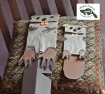
Yesterday I was so thrilled with the new logo I dangled it appealingly in front of Jean Matuska who helps with the web design and said, wow wouldn’t this look great on the header, gosh too bad no one knows how to put it there. Mean while I was dangling the logo appealingly in front of the designer Kiriko Moth and saying, gosh wouldn’t this look great on a hunter green table cloth, too bad its the wrong color.
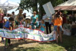
Joyfully, Kiriko offered to print the opposite of the design, and send that to our tablecloth order. And Jean figured out how to tuck the logo into the photo strip. Once we saw how easy it was to change the header I asked very politely, maybe someday, when she was burdened with free time, we could choose the photos together? Because our original web designer, Michael Cronnin, just picked those photos without our input. And Jean, who was inspired to great heights by the lovely logo and a charming owl protest on sunday, said, pick the photos and I’ll do it for you.
Give a hoot!
It was her 10th anniversary, so when they got back from a celebratory dinner, she made the switch! I wished her a very happy anniversary and assured her it was excellent luck to fix a beaver website on such an occasion. (Since beavers mate for life.)
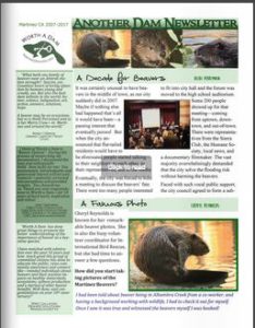
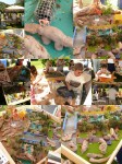
I love the new photo strip, all originals from Cheryl Reynolds, more than I can say. But I thought it would be good to pause and remember the old one fondly. It saw the beavers from a time of great danger to a time of civic protection. From a time when we the site had 80 readers a day, to a time when it had 800 readers a day. It was a gift from a friend who donated generously with his time and made the painstaking transition from martinezbeavers.com to martinezbeavers.org/wordpress. It featured the dam and the flow device because that is what everyone needed to focus on. Now it features our heroes. The strip is dead. Long live the strip.
